Tryngolza
Branding work and creative assets for Tryngolza, a breakthrough treatment in adult patients with the rare disease, Familial Chylomicronemia Syndrome (FCS).


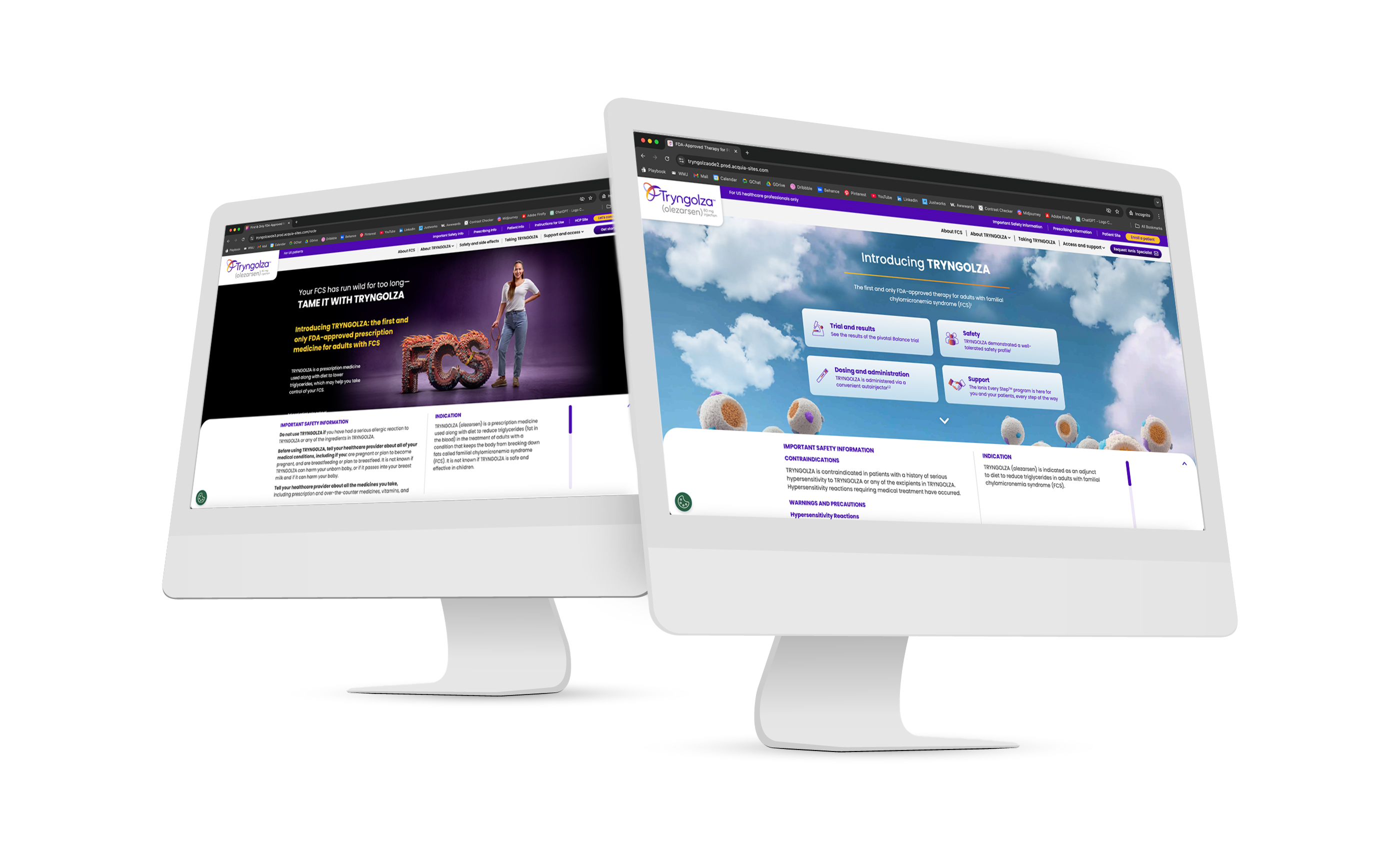
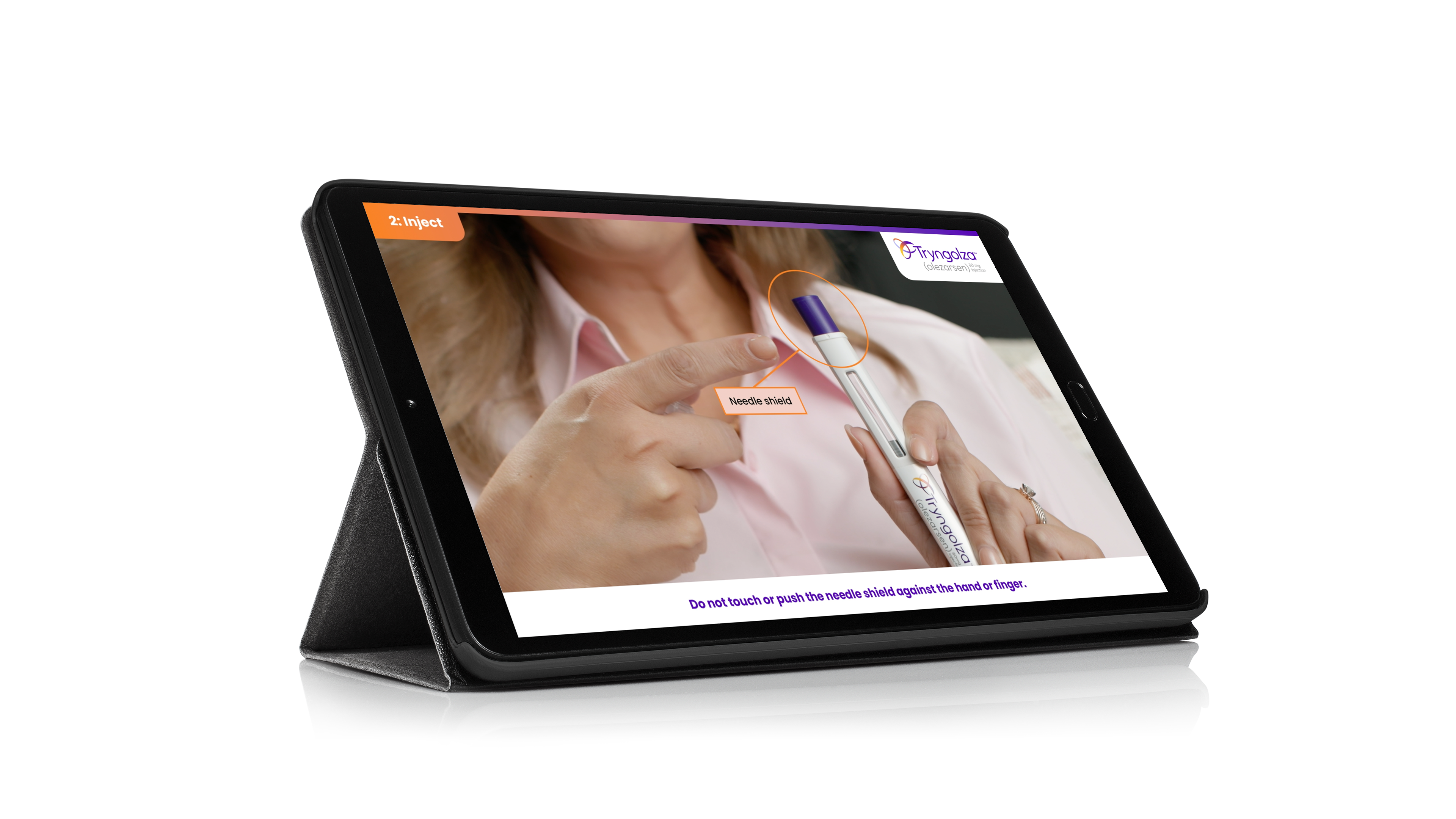
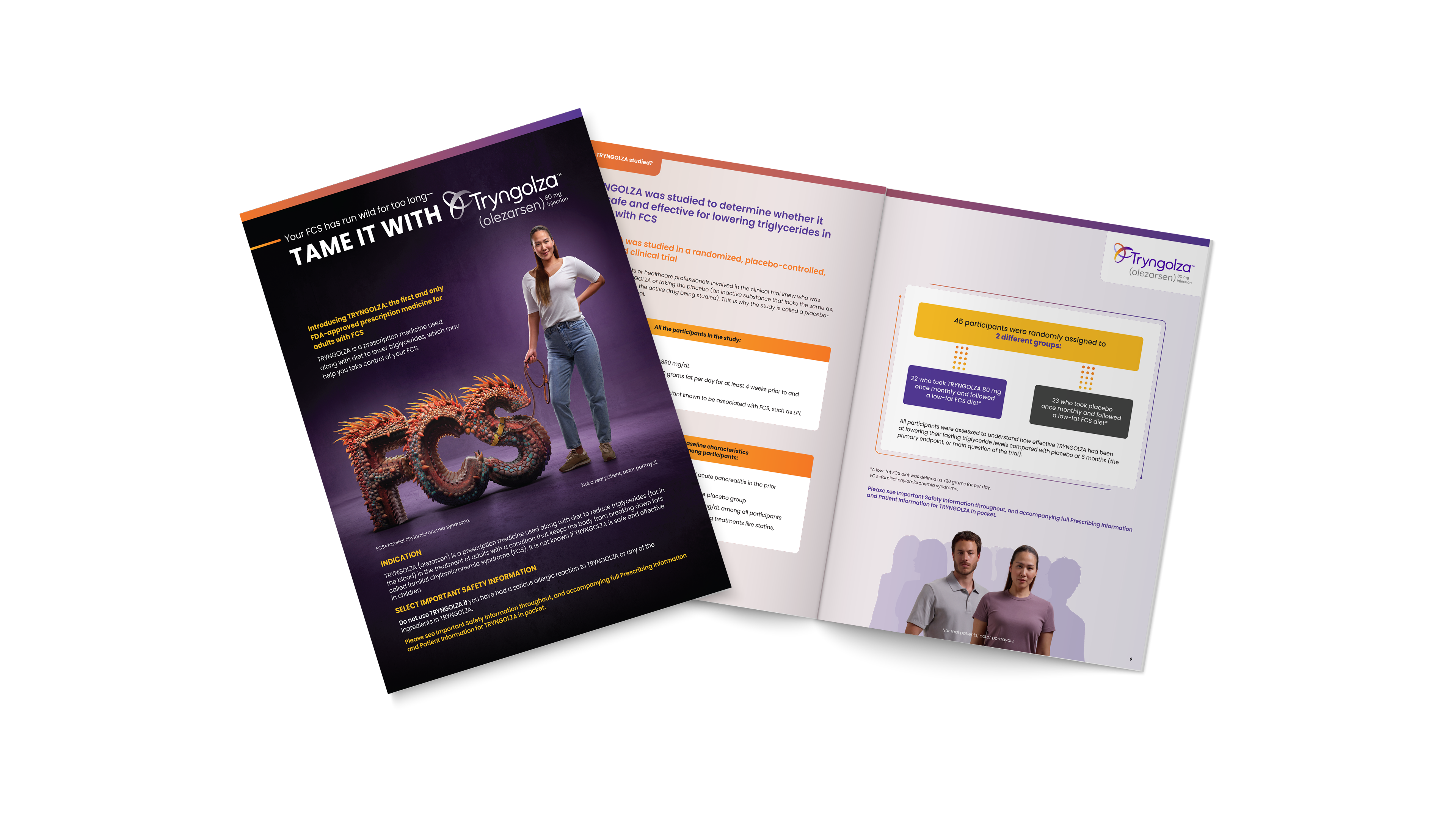
Produced a wide array of assets for a breakthrough launch in the rare disease space, including but not limited to websites, training videos, congress booths, detail aids, powerpoints, emails, banner ads, packaging, and assorted print materials.
Collaborated closely with our creative department, developers, SEO, omnichannel, and med-legal teams to deliver compelling work for our clients as part of the larger marketing communications strategy for this indication’s launch.
Unblur the World of HFpEF
An unbranded ad concept for healthcare professionals showcasing the differences in knowledge between two similar yet vastly different types of heart failure.
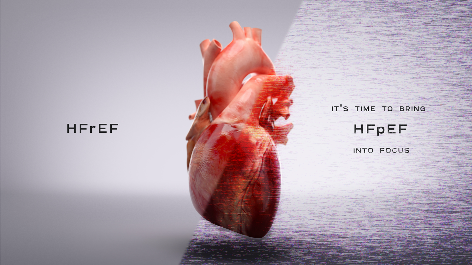
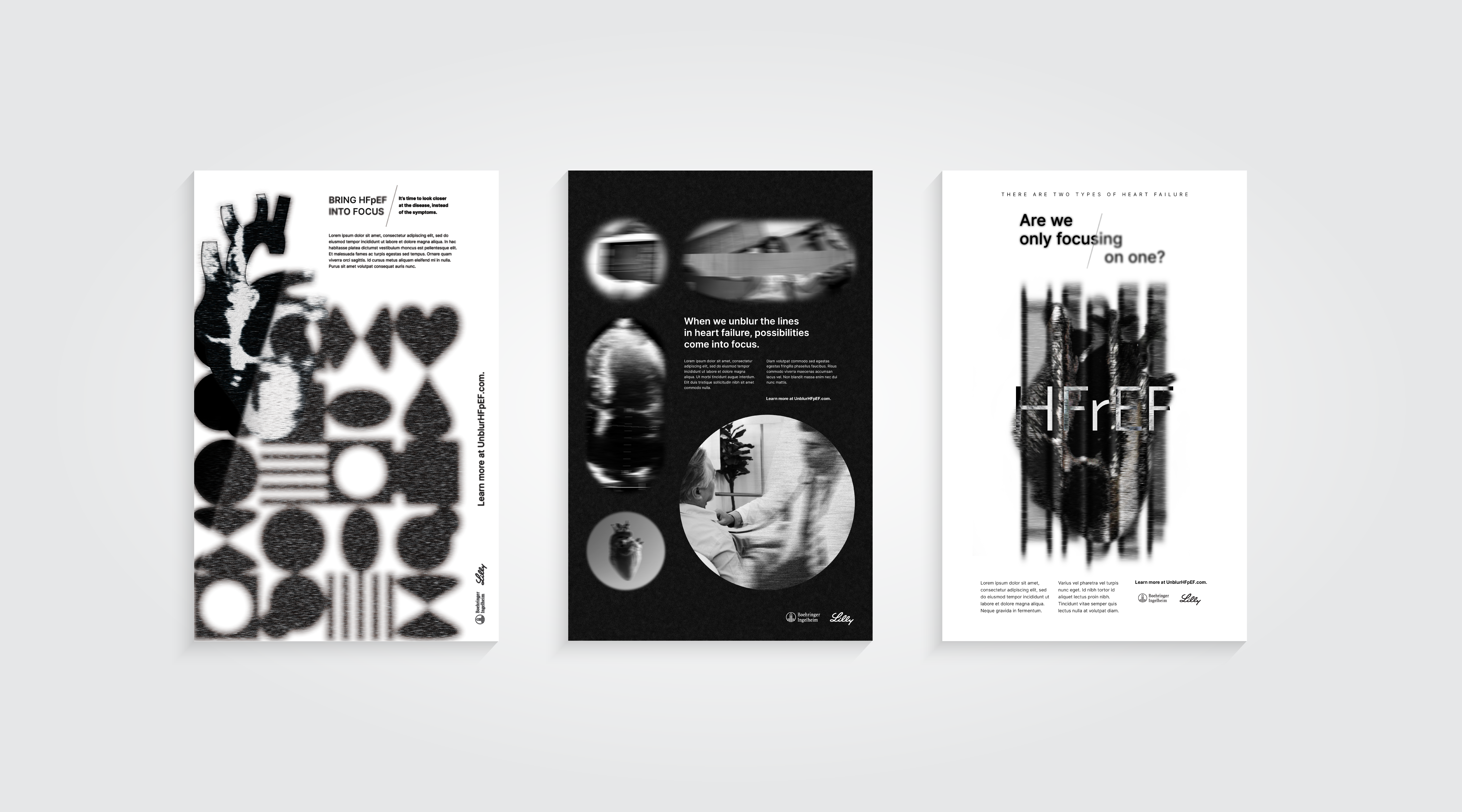
Echocardiograms (a core diagnosis tool for heart failure) and the static grain in them served as the main form of inspiration behind the concept and blur texture.
Directed the creative from its brief and through the presentation to the client’s global marketing team. Refined and tweaked the concept in market research where it resonated the strongest with cardiologists. Carried the overall creative out of concept and into development and deployment with a microsite, emails, facebook videos, and banner ads created off the initial concept.
Think HoFH Brochure
An unbranded informational leave-behind for healthcare professionals crafted to raise awareness around diagnosing HoFH in their patients.
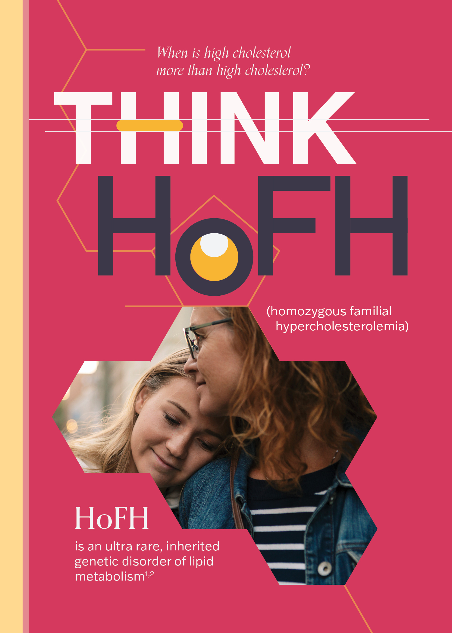
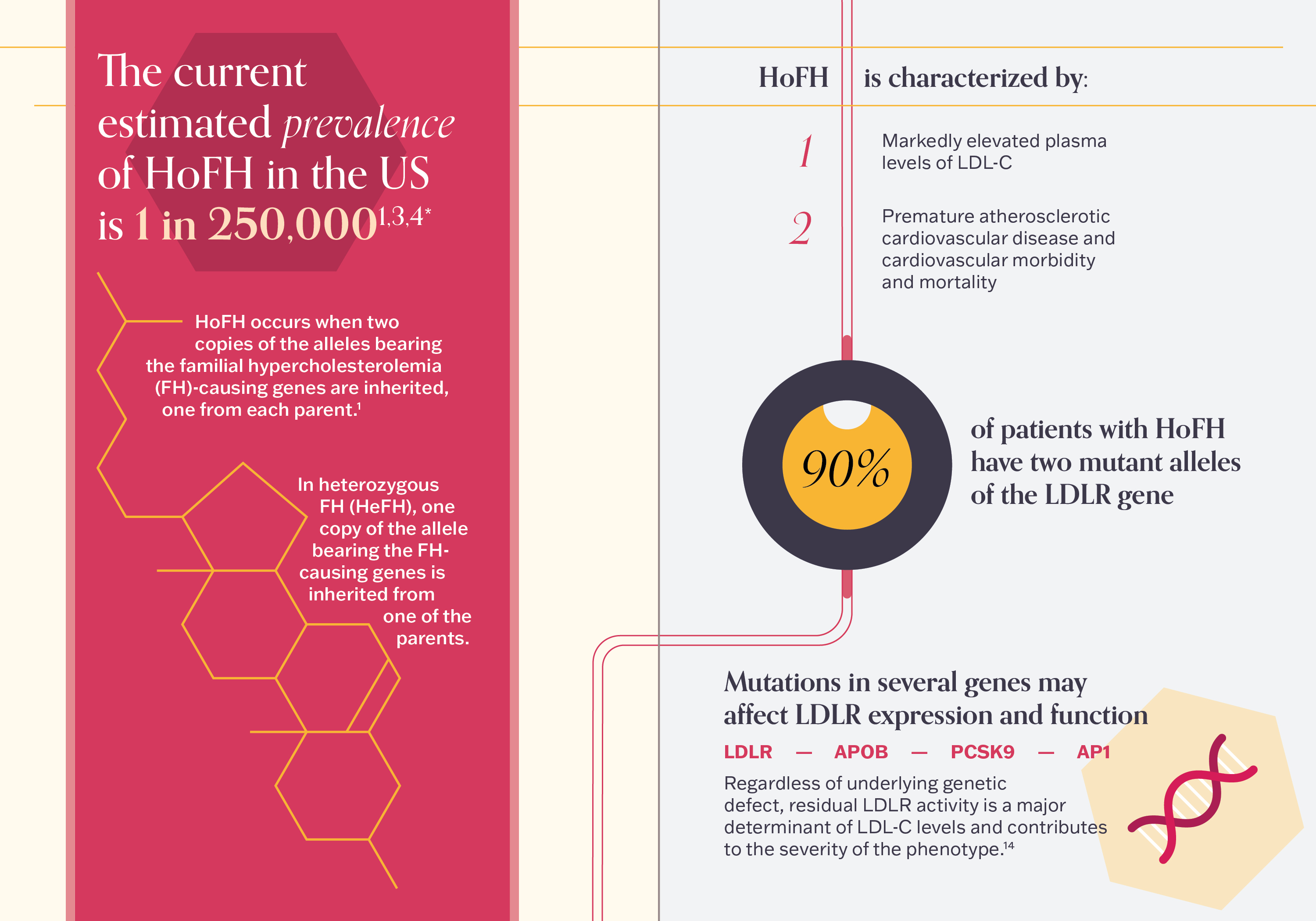

The hexagonal, honeycomb-like molecular structure of cholesterol is used as a key design element for imagery, copy, and icons to help make the information more focused and engaging. Thin rules similar to arteries also run across the page, breaking apart information into digestable chunks
Pitched and won the rebranding opportunity to create a unified and modular design system for all the client’s unbranded print material.
Republic Discord Branding Renovation
The new look and brand direction for Republic’s renovated Discord server, reflective of the intersection of Republic’s communities in a new shared space.
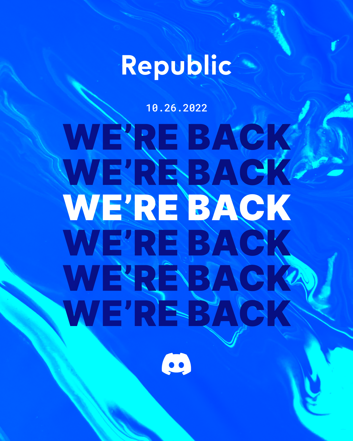

Color and visual style were inherited from both Republic’s brands since the renovated Discord presented a space where investors, founders, connectors, architects, and advisors could all co-exist.
Worked with key business stakeholders in marketing and design to push the visual and concept to a more compelling narrative and style to ultimately drive new investor growth and user retention by increasing interaction and engagement in the Discord server.
